Moodbar
Motion-led site for a brand that sells a feeling
Translating a finished brand into a site that moves
The client came with the brand done — logo, colors, typography, founder story, product copy, photography. The job: turn that brand into a site that can sell "eat how you feel" — emotional positioning that a static page can't carry.
We translated the brand into a layout and motion system that conveys three things at once: an athletic, active lifestyle; juicy, real ingredients; and a healthy daily routine. Motion ties them together — the brand isn't described, it's felt as you scroll.
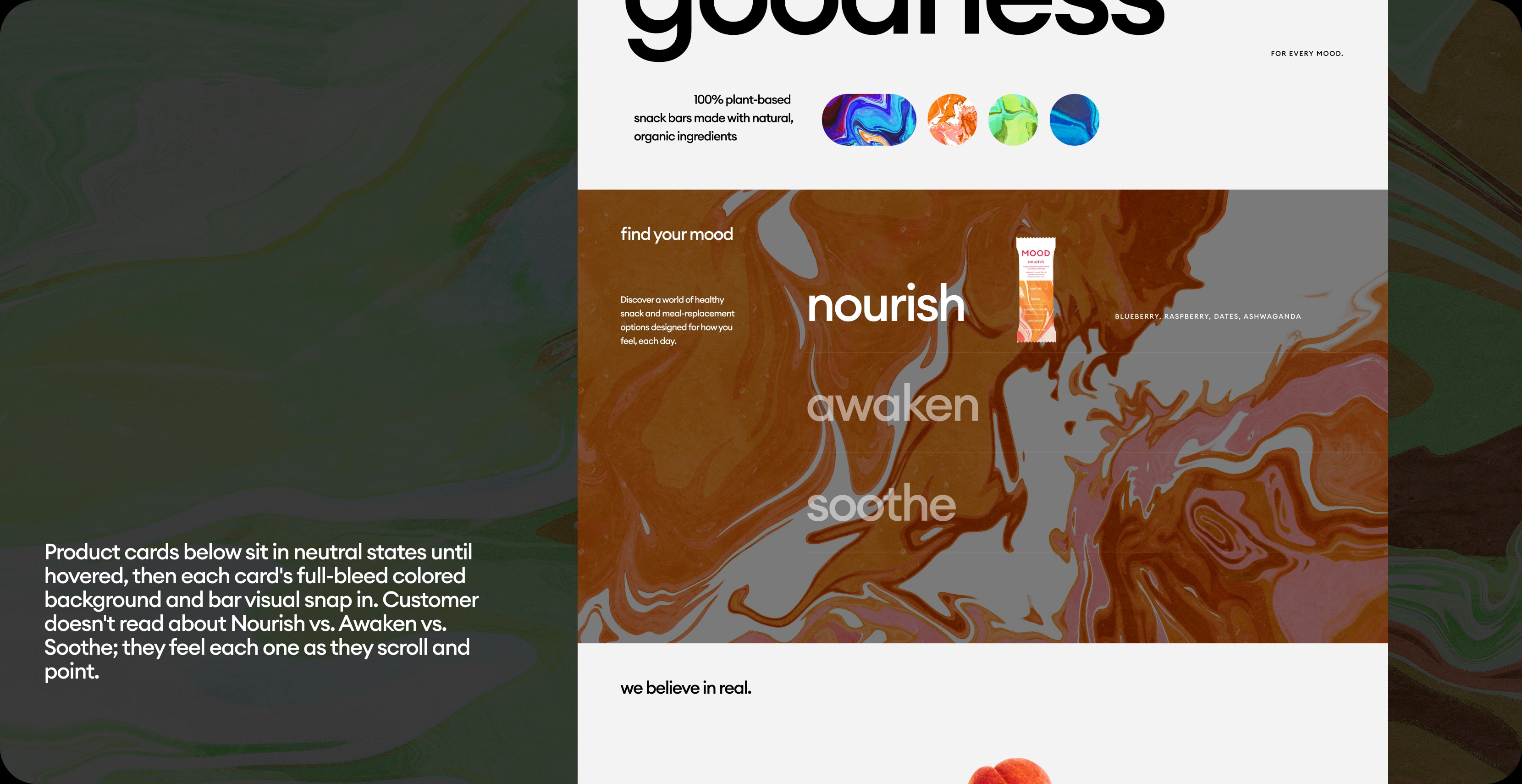
A homepage that shifts with the customer
The hero morphs between three mood states — color and typography shifting in sequence to cue what each bar does.
Tactile depth as ingredient proof
The "We believe in real" section on Home and the ingredient sections on Nutrition run imagery on parallax layers moving at different speeds — fruits, seeds, and spices float through the viewport at different depths.
Page physically feels closer to real food than to packaging photography. The "organic, plant-based, unprocessed" claim lands through motion, not bullet points.
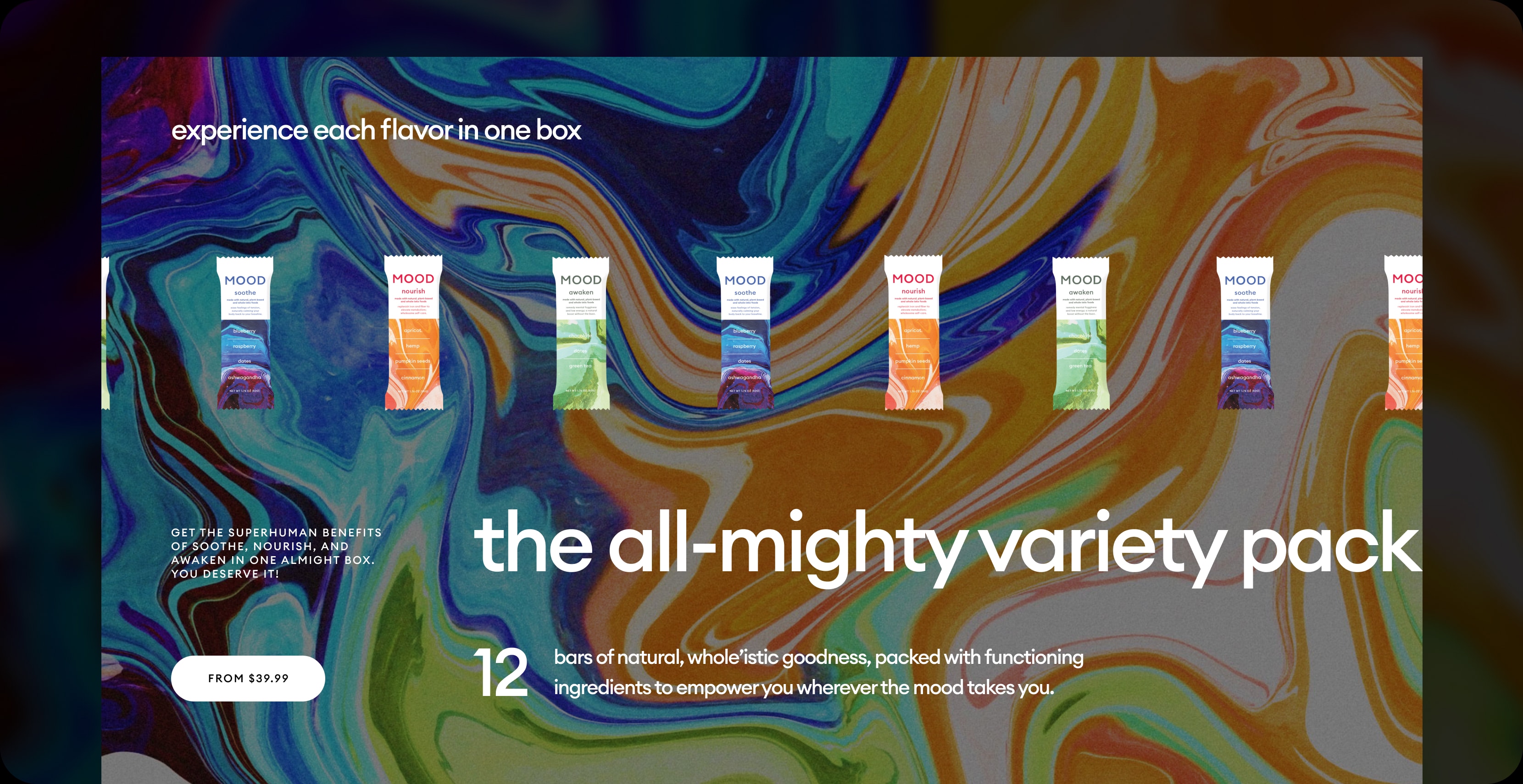
Bars as objects-in-life, not SKUs on a shelf
Continuously scrolling bar carousels run across Home, About, and Nutrition — multiple lanes moving in opposite directions, overlapping.
Removes the e-commerce-grid feeling entirely. Catalog reads as a brand world, not an inventory.
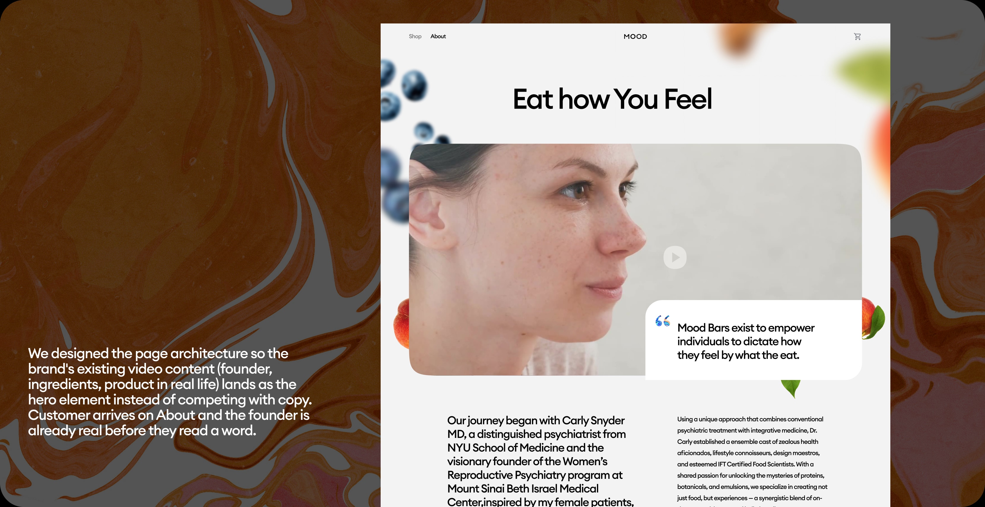
Letting the brand's own footage do the heavy lifting
The About and Nutrition pages open with full-bleed silent autoplay video.
Book an intro call
15 minutes — see if we're a fit before anything else.